Getting Back Into Writing

Why I Had A Leave Of Absence 

Sorry again to everyone that follows this blog. I had to put my writing on the back burned because I was working 50+ hours a week at the hospital and trying to finish my freelance projects that I had  going. I was finding that I couldn’t get anything  done and I was drowning in work and everything started to pile up. It was starting to feel like the trash compactor scene from Star Wars Episode IV – A New Hope. It made me take a hard look at myself and the goals that I have set for the next two years. And I found that I wasn’t getting my freelance work done. Which was the reason I moved back in with my parents in the first place. To get my name out there and save up money to move elsewhere. So I decided to take a leap of faith, and quit one of my jobs and pursue freelancing full-time. So instead of working 50 + hours a week at the hospital I would be working 35 hours on design work/ getting new clients and 15 at the hospital. That would give me enough cushion for the times that I wouldn’t have client work. So, I doubt this will be the last time that I take a leave of absence from writing for this blog but I can tell you this. I will never stop designing and I will never stop writing. So if you have made it this far into the paragraph I wanted to say thank you.

Unfortunately I have to wait a little while until I can release some of my work on Behance for an update. I need to make sure that the work is copyrighted correctly before I can upload the work so stay tuned for that. I’m also doing a project in the program Sketch Up so when that is all said and done I will make a post devoted to not only learning sketch up but my process for approaching a project like making concepts for a building design. I also plan on doing weekly book reviews for books in the design field as well as books that can be applied to graphic design for further learning outside of our profession. Also I want to come up with little design challenges each week. I would love for people to comment on the challenges below with their solutions. Just another way to make your design skills that much more elastic.

Book Review

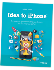
 Image

I just got done with the book Idea to iPhone: The essential guide to creating your first app for the iPhone and iPad. It is a great book about how to get into the app industry. What is great about this book is that it doesn’t necessary teach you how to create an app from the coding perspective( which many great books and resources are available about) but it teaches you about the industry, how to promote your app, and the common pitfalls that happen in the process of making an app. It also covers some of Apples weird rules when it comes to the App Store. Overall, without giving too much of the detail away I would say this is a great book for anyone who is fascinated with the process of developing apps for the mobile market. This book is App Store specific but a lot of great tips for making apps in general are included. Even if your focus is the Android market you can learn a lot from Carla White, she has a lot of wisdom in this newer market and this book is has an enormous amount of information in it about app development. Check it out today. Here is the link to the website as well as Carla White’s twitter.

http://ideatoiphone.com/

https://twitter.com/carlawhite

Thank you,

Tim

Memories Of Trains ( Digital Art )

Back Story
So, one of my coworkers wanted me to make them digital art for their office but instead of using the work that I have already done I wanted to take a fresh start. So I immediately started plugging away with the questions about his different hobbies and even beliefs. I wanted to find something that was not only unique to my town but unique to him. So I found out that he was really into trains. So I hit the streets and started to come up with concepts about how to show a train in all of its glory. He reminisced about how he loved watching the trains go by as a kid. There was something about the robustness of the giant man made machines that have caught his eye even as a kid. So my concept from there seemed pretty straightforward.

Concept: Make the train look powerful. Give the picture a perspective that makes the viewer feel like they are a kid looking up at this modern marvel. Then on top of that add textures that highlight on the idea of travelling across the country and give the overall composition a weathered vintage feel. 

Anyway, here is the original image that I shot that day. I think it conveys my concept quite clear. 

Image

Although I don’t think that this shot really displays the perspective of a kid I do think that it shows the mightiness of these man-made marvels. So now I was onto my next phase with this digital art piece. The painting phase in Photoshop. I took different grunge textures and a picture of a map of the united States. Here is the result. 

Image

I’m rather happy with the results. I never would have made anything like this if I wasn’t a listener first. I think as artists sometimes we have a problem listening to our audience and that can often create a mental overcast when working on a project.  It can pinhole our creativity and I always try to keep an openmind when working on projects. 

Thank you,

-Tim

Design World: Chilean Design

I wanted to add a new segment to this blog. As I grow as a designer I find that my interests grow as well so this blog keeps expanding with the topics I want to write about and cover. For a while i’ve been doing research on different designers from around the world and I like to investigate what other artists and break it down from region to region. Highlighting areas of design that I don’t think are in the design limelight.

Chile

Is a country located in Latin America. It is home to over 17,224,200 people [1] and it has what is considered to be an upper middle economy. [2] I chose this country to focus on because I believe that Chile is on the rise not only in an economic sense but also in the arts. So here I have highlighted a couple of different designers and artists and I hope that this will encourage you to check out the rest of there work and the work of other artists from Chile. 

Eduardo Araya

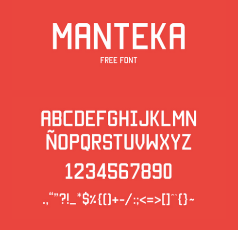
He is a graphic design student that is from Chile.  I enjoy his work as a typeface designer and I have used this typeface Manteka before, but at the time I found his typeface on a blog it was cool to find out that he is from Chile and I could feature his typographic work for this project. Here is a picture of the typeface Manteka and his personal site as well as his twitter handle. Check him.

Image

http://www.eduaraya.com/
https://twitter.com/bamundi

New Fren

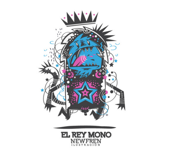
So i’m actually having an onerous time trying to find more information about this character designer/illustrator but I do know that he is from Chile. His work is elaborate and crisp. Here is a sample of some of his work. Check out the rest of his work on Behance.

Image

http://www.behance.net/newfren


Nicolás Rojas León


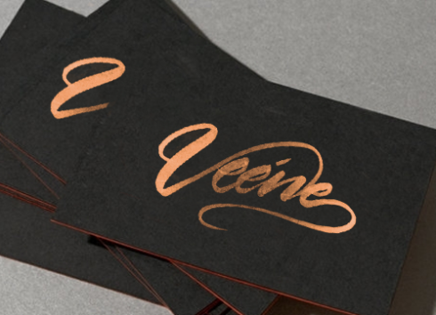
A graphic designer from Santiago, Chile. This designers’ main focus is calligraphy. calligraphy is something that I personally could never master so I have reverence toward anyone who can make calligraphy. With that being said, I spotted him on Adweek. His style is decorous with just the right about of tension and fluidity within each character to make excellent calligraphy. Here is a sample of his work for a company called Veene.Image


http://talent.adweek.com/nicolasrojasleon
https://twitter.com/nrojasleon

Conclusion
This was a fun thing to research. This is only three of the abundant talent that is coming out of this country. I encourage all of my readers to find a country that you haven’t heard very much work from and investigate and find work that you haven’t seen before. It’s a great exercise to not only teach you to think globally but also to be more exhaustive in your search for the immense world of graphic design. 

Citation 
[1]
http://www.mapsofworld.com/chile/facts.html
[2]
http://data.worldbank.org/country/chile

Thank you,

– Tim


Data Visualization And Graphic Design

Data Visualization is a big word in countries like America and India. It is often used out of context but from my understanding of it(and my over simplifying of the term) data visualization is the study of representing data in a visual way. That means this topic of study has a broad range of applications. With that being said I would just focus on how visualization relates to the world of graphic design. 

What does Data Visualization Look like?

Here is are some examples of how beautiful data can be. I’m posting them as links because the files are huge and I want everyone to see the intricacies of the designs and some of them are websites that are devoted to data visualization. 

http://circos.ca/img/news/zukunft-02.jpg

https://drunksandlampposts.files.wordpress.com/2012/06/philprettyv4.png

http://static.vizworld.com/wp-content/uploads/2012/02/Event-map_eng3.png

http://www.infogra.ph/wp-content/plugins/infographics/images/m_1322610034tension-in-the-middle-east-data-visualization.jpg

http://www.informationisbeautiful.net/visualizations/caffeine-and-calories/

http://www.leedsbuildingsociety.co.uk/resources/kick-my-habits/

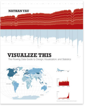
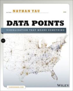
These are just a few of the thousands of examples of how data visualization affects the graphic design industry. We are visual storytellers and it is our job to shape this data in a way that makes sense. Now if the concept still isn’t clear (and it wasn’t clear at first for me either) then I suggest these books by the author Nathan Yau ( @FlowingData on twitter ). He is a Statistician with a Ph.D from UCLA. He knows how to teach the material in a user friendly way and if you read his books you will find how interesting of a man he is. 

Image


Visualize This is his first book. It covers some basic points about data visualization and some of the mechanics behind making these types of graphics. This book is great for the beginner who is just learning about data visualization. 

Image


His second book Data Points covers the greater conceptual side of data visualizaton. Which is just as important, if not more important, than the technical aspect of it. Without a compelling story the data is just data and there is no reason for a person to devel into the topic. 
So in closing I would like to challenge the  reader to develop their own data visualization topic. Apply it to whatever your interests are and make a data visualization chart. It’s an interesting project to take on. It’s like a visual research paper and at the end of the day you can walk away as a richer, more knowledgeable person. I know for myself I am looking into learning the programming language Processing ( http://www.processing.org/ ) for my data visualization. As always, if you have any other book suggestions, writers, or programs that would be helpful to this topic let me know and I will include them. 🙂

Thanks,

-Tim

Finally Done With School Some Thoughts On Design

Sorry For The Hiatus.
Sorry again for the hiatus everyone but I was finishing up with my last semester of college and things got really busy with work and finishing up all of my senior projects. But now that I am done with school and I start my new job on Monday i will have more down time in order to start writing articles again. So expect more digital art work coming up and expect more design tips and book reviews. Again, here is a link to my portfolio that I have been working. I still have more work to put up but this is where i left off. Check it out. 🙂

http://www.behance.net/timmcgrathdesign

Graduation
So it really happened. The last three years of my life I have devoted to studying the field of design and I must say that I don’t regret anything. There are obviously things that I could have done better but I wouldn’t have it any other way because now I have more clarity on the direction to which I would like to take design. I’ve studied drawing, typography, visual communication, numerous software programs, and i’ve now worked with 7 businesses and helped them with their design solutions. I’ve solved problems creatively and logically  I now have a systemic approach to the way that I design but I still remember that every project is different so it’s good to always keep an open minded. 
Advice
My advice is fairly simple and straightforward. Never take your time in college or your internship for granted. These years are special and it is a lot easier to develop and hone in on your craft when you are young then to try and do it later when you have a family. So cherish this time while your young and use that time to develop your skills. I am very big on the conceptual side of design and I love the idea of mind mapping. Whether you do this by hand or you use a software suite this is the ideal way to go when you are trying to work out your ideas. I personally use a software suite called Mind Manager but, that is not the only method for “Mind Mapping” there are many other solutions and methods and I suggest you do your own research (which is why i’m not leaving a link 🙂 )
My second piece of advice is to never drop the pencil and paper (or your paintbrush). This is one of the most important tools that you can have. Don’t get me wrong. I built a workstation for myself and I have a smart phone but at the end of the day nothing is more liberating than an idea and a blank piece of paper. This is your lifeblood. This is what we thrive on as designers. Remember, the technology will always replace itself over the years. It’s the idea that you are getting paid for not photoshop filter(unless you are a production artist). I think this is something that students, including myself at times, loose tract of. As designers we are creative problem solvers above anything else.
http://blog.visual.ly/the-case-for-designing-and-writing-by-hand/
My third piece of advice is to learn how to code. Now, i’m not saying that you have to design the House Of Cards algorithm for Netflix or be a cotributing member of the W3C and give up on your dreams of ever being an print designer but, what I am saying that this is a necesary skill for designers of the future and above all else, it teaches you how to think about things in a structured and logical way and nothing is wrong with that. Here is an article from Six Revisions that John Urban wrote that furthers my point. http://sixrevisions.com/web_design/why-designers-should-learn-how-to-code/
All I am saying is that if you can think creatively and you can think in code then you will be infinitely more marketable then the people around you because most artists don’t want to learn how to code and most developers don’t want to learn how to design so if you can train yourself to be the middle ground then your chances of getting hired are more likely. 
My finally piece of advice is to never stop reading and learning new things. It is a cliche piece of advice but it is so true. College isn’t the end of your learning it is the initial framework to which you will build your life and career as a designer. This industry is fast and you need to stay caught up. Here are some helpful links that I use. 

http://www.safaribooksonline.com/
Great resource for digital books it is subscription based but it is 75-90% cheaper than buying each of the books that you read.
http://www.lynda.com/
Great resource if you don’t like to read and you want to keep catch up with videos. Lynda.com also listen to there customers and i’m pretty for sure they have taken my suggestions for some courses. 🙂
http://www.digitaltutors.com/11/index.php
This is personally my favorite site for learning how to do anything related to motion graphics or production skills. This isn’t the place to go for learning dreamweaver of InDesign but this is the best resource for learning After Effects, Photoshop, Cinema 4D, and over 50 other software programs that are used in the special effects industry. I love this site. When I get more money I an renew my subscription so I can learn Cinema 4D.

Even if you aren’t a student I hope that you have learn something new from this post. I apologize again for not updating this as much as I used to, I got busy and need to wrap up  my life as a design student. So thank you again for reading this expect weekly articles starting next week.

Thank you again,
– Tim


Another branding project and another good branding book.

This is one of my favorite books on branding, hands down. Alina Wheeler writes one of the most through and down to earth books on designing for a brand. Her book has a lot of great points and their are just enough visuals to drive home the point. She focuses on the brand strategy/culture of an organization but she does it in a way that doesn’t feel like a “business book”. It feels like you are getting advice from a real person that truly understands the medium.

Now I always try to show an example of how I have used the author’s book in order to better myself as a designer so here are the examples that I am going to show. This was my initial idea for a logo that I designed for a fictional airline that I had to develop in my graphic design class. Here was my initial concept for the brand.
Image

Now after I meet with my teacher I realized this was a dated approach to a logo design and it actually looked like a similar logo that was designed for the international harvesters logo that was made back in the early 80’s. So I had to do a little bit more conceptual thinking and decided to delve into the problem a little bit deeper than I did will the previous design. So I polled some different ideas and at the end of the day this was the logo design that most of my campus, my teacher, and myself fell in love with. 
Image

The color scheme is based on a picture of a sunset that I found. The sky had these beautiful greens and blues mixed with this tan color and I couldn’t get over home awesome that looked so I decided that was going to be the color scheme for this project. The typefaces were based off of some old 1920’s magazine ads that I found while searching for retro magazine ads.
The concept behind this logo is that Horizon is always going to be over the international borders therefore Horizon is peaking over the border that is international. I feel like this is an amended, more though provoking version of the logo that I had before. Here is a link to the finished project.
http://www.behance.net/gallery/Horizon-International/8203045

Here is the link to Wheeler’s book.

http://www.amazon.com/Designing-Brand-Identity-Essential-Branding/dp/1118099206/ref=sr_1_1?s=books&ie=UTF8&qid=1366420048&sr=1-1&keywords=graphic+design+branding

Thanks for reading,

Tim


Keep reading. It’s one of the most marvelous adventures that anyone can have.

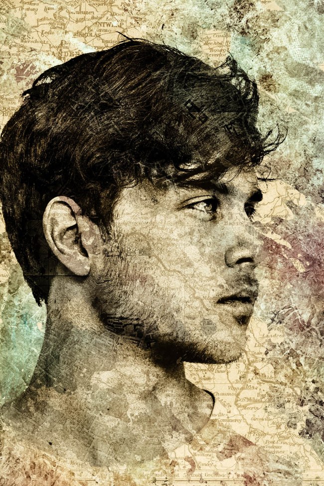
The quote for this section is by the Lloyd Chudley Alexander. He was a fantasy writing and he wrote numerous children’s books. So this is another digital art piece that I have been working on. This is not a picture of me or any of my friends but I wanted to get the idea out of my head so I just used a bunch of found images in google and started to work out the kinks right away.
Anyway, here is the image.
Image

I started out with a blank and white photo of this man. I then pulled out a bunch of the definition in his face in order to give the portrait a more drawn feel. I started to search again and found these old maps of europe. I then used a paint brush in photoshop and drew in different parts of the map in order to get the desired look that I wanted. After that, I decided that the image had too much sepia in it so I started to spread in the blueish green color. 
All in all, I think I am going to make this into a series. I like the concept of imprinting the places we have been into the portrait of someones face. It’s another way in which we can show the roads we have travelled. Hey, maybe that might be the title after all.

Figure Drawing and Form and Space.

This article is about the two of the things that I struggle with the most as an artist and as a designer. And here are two resources that that I have used and the other I just got a copy of today. Here are two of mine.

  • Hand drawn typography
  • Drawing the human figure (I struggle with the face the most).

I remember being terrified of drawing the human face in class. I would always try and site in a stop that made me not have to draw the face. My teacher caught on to this after about 3 critiques and then made me always site face first or at and angle with the face of the model directed at me for the rest of the semester.

My other struggle was in my Graphic Design II class. I had always thought that typography was an interesting topic but I never took it all that seriously until I had to draw type exactly to scale (96 point to be exact) of what was on the computer. I picked the letter “Y” and “9” and started to sketch from there. It took me a long time but I ended up coming up with this logo.
Image

I then noticed that they “Y” and the “9” became a martini glass and decided that this was the perfect logo for a bar and restaurant. And then turned it into a brand. Here is the project.
http://www.behance.net/gallery/Y9-Bar-Restaurant/2899405
Anyway, I just wanted to stress the importance of handing drawing type for graphic designers. Personally, I like to take about an 1-2 hours a week and draw random letters in my sketch book I find that this is a good primer of visual form and space. It is a good exercise to do before you start designing something. It is like a vocabulary builder for visual form. I suggest this website for random fonts to sketch.

http://www.fontshop.com/fonts/random/


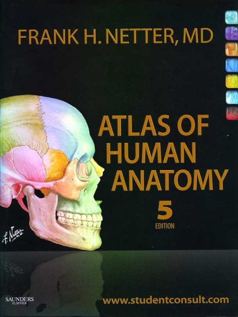
I read a while back that a good way to learn figure drawing is to study an anatomy book. Now I took a figure drawing class about two years ago but I want to understand the figure on a deeper level, as in the muscle and skeletal structure as well, so I found this book and it has high reviews on amazon.
Image

I plan to upload my sketches from this book and what I have learned from it in June. I am setting a date that is quite far away because I am going to be busy with graduation and moving. Either way I would suggest buying this book or checking it out from your local library the visual imagery is gorgeous and it is well documented.

In closing I would like to say that these are not the only things that I struggle with as a designer but these are two of them. As a designer I feel like it is my obligation to always strive to be the best that I can be and these are the smalls ways in which I feel that I am making a difference in my artist endeavors. I would love to here feedback on what you struggle with as a designer/artist and what you do to learn this wonderful craft.

Thank you,

Tim


Digital Art Work


Image

Painted Psyche In Blue – Digital Art  

*quick sidebar
I’ve been been busy again so I sorry about not having more content. As I said before this is my final semester of my undergraduate degree and I have been busy learning the new HTML5 Canvas spec/the javascript needed for a website that I am building in about a month.  But I have three posts coming this week so stay tuned.

Digital Art Is My Creative Outlet.
I am huge fan of digital art and I often find that I turn toward digital art whenever I feel like I am stuck on a design problem. It is my creative outlet, and one of my biggest sources of inspiration. I love using a word generator (this is one of my favorites http://andrewbosley.weebly.com/the-brainstormer.html) and combining that with found images. The words for this was splatter, blue, and sadness where the topic for this composition. I usually work in Photoshop but sometimes I bring in elements from Illustrator into my work. It depends on how many draw elements that I have included in the piece. For this project I used a found portrait and I use Photoshop blend modes and brushes to execute the look for this piece. My creative process varies depending on the project. I usually try to write a paragraph or too about the project before I start. I then make simple sketches off of the word associations. I then put on some headphones; zone out, and work on my Wacom tablet until I like what I have completed the piece. 

A Checklist When Branding

I love the essential elements serious by Rock Port publishing. I find that these are great books to have around whenever I start to work on a new branding project because I like to take each example in the book and relate it back to the project that I am currently working on designing. Things like would the organic nature of that typeface work with this restaurant logo? or Would using a vector element such as a circle heighten the design of the project I am working on? I would probably get to the solution eventually but it helps me sort out all of the problems that I am currently working. For example: This was the first logo that I made for a fictitious restaurant named tomi. I was going for a natural wood feel with references to the red in the Japanese flag and gold for royalty.The goal was to design a logo for a Japanese sushi restaurant that would be located in the main district of my school’s campus
Image

Then I went though the checklist from this book and started to do research on restaurant logos and did research on the history of Japan. I then decided to reference the sun inside the flag of the Japanese logo. I then wanted to reference the beautiful brushwork of their written language. A week later I came up with this design for the logo branding

Image
I think that this is evidence in and of it’s self that it is better to have a checklist or some sort of book to reference when you are going though the design of a project. It really hits home with a formula for successful branding. As I say in everyone of my book reviews, this is a book that I would highly suggest. It is a read, not to technical, and this visuals in the book are beautiful. I encourage everyone to check this book out. Here is the link to the book on

http://www.qbookshop.com/products/199801/9781592537938/Essential-Elements-for-Brand-Identity.html

Thanks,
-Tim